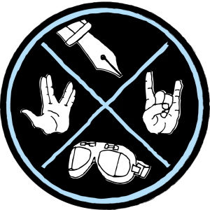
Over the past week, I’ve been giving a lot of thought to my online identity, and the archipelagic nature thereof. I’d been having a difficult time reconciling the different aspects of my personality, and the related interests, into one cohesive whole. I’m a singer-songwriter, whose roots are in rock music, who has a deep and abiding love for the english language and uses words like “archipelagic”, who rides a motorcycle, who has great pride in his Scottish heritage, who is a unabashed geek in many areas – technology, graphic design, science (fiction and real-world), music… you get the picture. At various times I felt like I was allowing myself to express one or two of these facets of my personality, but never truly showing the “real me”.
After a discussion with my new friend Loren Weisman at the Millennium Music Conference last weekend, I concluded that something needed to be done about this. The solution, I realized with Loren’s help, was to bring harmony to my interests by celebrating the contradictions that make me who I am. If you’re reading this blog on my website, you’ll see emblazoned in orange letters above this post the four Michael McFarlands that at various times will rear their head:
Writer. Rocker. Biker. Geek.
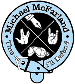
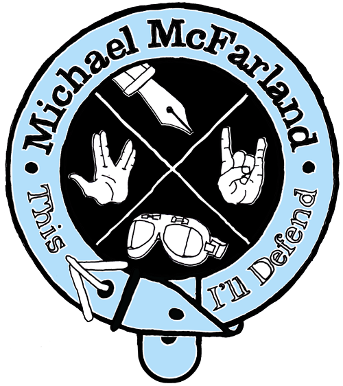
Within a few minutes of our first meeting, Loren was also berating me for the fact that I didn’t have a logo. I pointed to the hand-drawn logotype that I’ve been using for the past year and a half, since I released my first EP, which he dismissed with, “That’s just a font. It’s got character, but it doesn’t sum up who you are.” So I had another challenge: how do I sum up those four aspects of my personality in one cohesive logo. I found myself lying in bed that night rolling ideas around in my head, and then all of a sudden it hit me: The McFarland Crest.
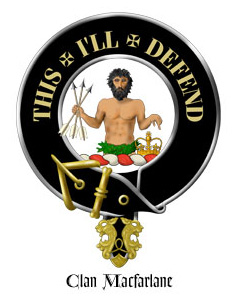
As you can see to the right of this paragraph, the crest of Clan McFarland (also written MacFarland, MacFarlane, Mac Parlain) is a shirtless dude with an awesome beard, clutching a handful of arrows and pointing at a crown, encircled by a belt with the motto “This I’ll Defend.” Or to put it in the language of heraldry, “demi-savage proper, holding in his dexter hand a sheaf of arrows, and pointing with his sinister to an imperial crown, with the motto, This I’ll defend” (Thanks Wikipedia!)
I’ve been a fan of that motto ever since I first encountered it several years back, and thought it was pertinent to the idea of what I was doing with this logo – proudly claiming the various aspects of who I am, and that I will stand behind them. As heraldry is one of the earliest examples of logo design, what could be more appropriate than to use that as the basis for my logo? I decided to take the “writer, rocker, biker, geek” idea, and abstract each of those concepts into icons. The pen, the rock’n’roll “devil horns”, the goggles I wear on my motorcycle, and the Vulcan salute. Live long and prosper.
Bringing the logo to life:
 Since Made a Mess, I’ve hand-drawn most of the artwork related to my music with felt-tip markers, but none of those pieces began that way. I’m far more comfortable designing on a computer than with a pencil in my hand, so I began my process (as I did with all those other pieces) by creating a vector-based design in Adobe Illustrator.
 When I felt I had the design to a point where I was satisfied, I saved it to a PDF, which I opened on my iPad.
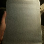 I then wrapped my poor iPad in tracing paper, which I taped to the back with electrical tape – my artist tape was nowhere to be found. You work with what you have!
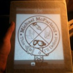
I took a screen shot of the vector image, and set it as my lock screen – the touchscreen works through the tracing paper, and I didn’t want to the image moving all over the place. Voila! A digital light table.
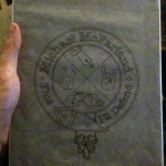
Traced the image with a Sharpie finepoint marker – took about 15 minutes.
Scanned that back into the computer, did a bit of tweaking in Photoshop & Illustrator to get the colors right while maintaining the hand-drawn feel, and here’s my final result, soon to christen bathroom walls across the country!


