Update 08/12/2020:
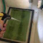
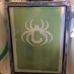
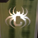
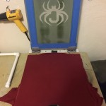
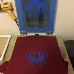
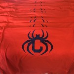
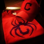
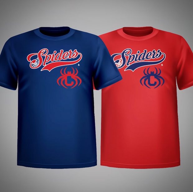 We’ve almost sold out of the hats, all the pre-orders of the masks are in the mail, so why not some shirts! These Cleveland Spiders Shirts are now available for pre-order – $20, free shipping, and again 50% of profits from these will be going to the Lake Erie Native American Council!
It’s been awesome seeing all the pictures people from around the country have posted with the hats and masks, I’ll be sharing a gallery of some of those soon!
Update 07/27/2020:
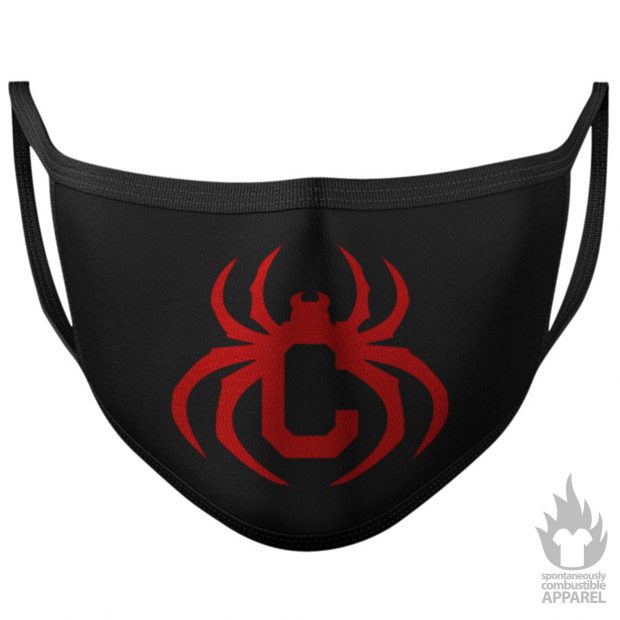
It looks like this pandemic thing might be around for a while… which is why we’ve just opened pre-orders for Cleveland Spiders Masks. Just $13, free shipping. 50% of profits from these will be going to the Lake Erie Native American Council.
Manufacturing of the hats is almost complete, and we expect to have those in the mail to pre-orderers by early next week!
Update 07/14/2020:
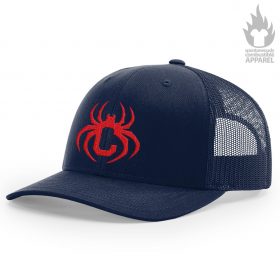
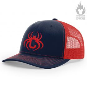
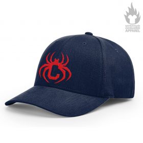
Since the idea of renaming Cleveland’s baseball team has come to the forefront of national discussion, there’s been a ton of requests for Cleveland Spiders caps like the one I posted before. So, first things first, caps are available for pre-order from Spontaneously Combustible Apparel! We have 3 styles available:
So get your order in now! 50% of profits from the sales of these caps will be donated to First Nations Development Institute:
Through a three-pronged strategy of Educating Grassroots Practitioners, Advocating for Systemic Change, Capitalizing Indian Communities, First Nations Development Institute has been working to restore Native American control and culturally-compatible stewardship of the assets they own – be they land, human potential, cultural heritage, or natural resources – and to establish new assets for ensuring the long-term vitality of Native communities. First Nations serves rural and reservation based Native American communities throughout the United States.
I’ve also put in some time imagining what other elements of the Cleveland Spiders brand would look like, for example:
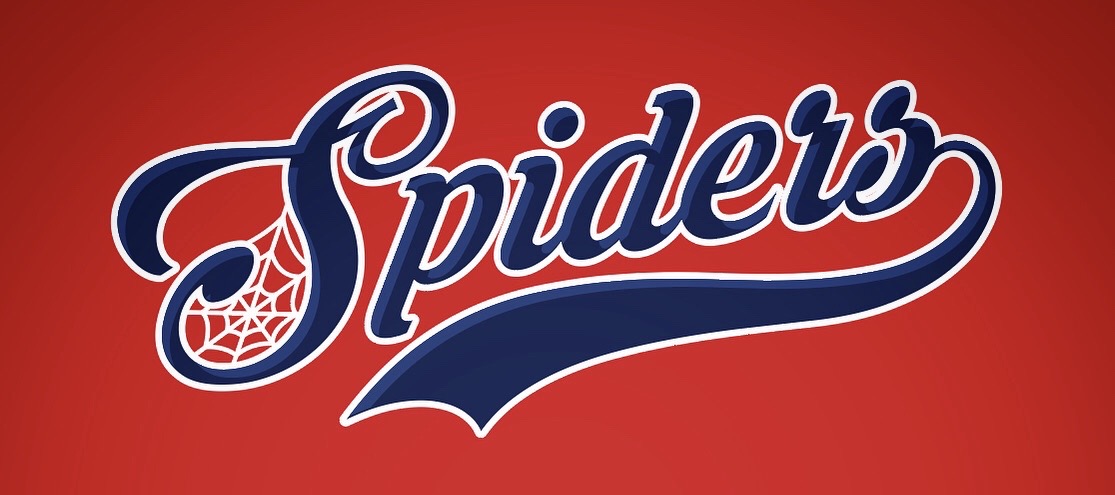
I put together a design for a Cleveland Spiders Logotype / Word Mark:
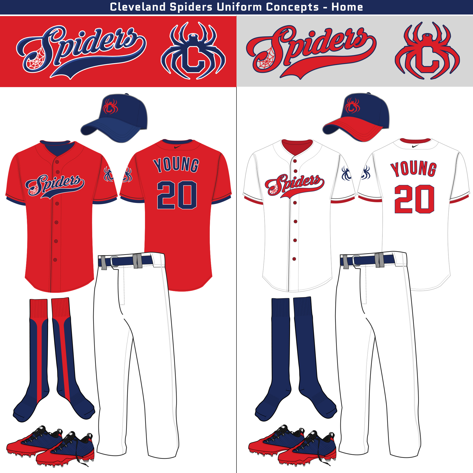
Came up with a proposed design for Cleveland Spiders Uniforms:
And just for funzies, made a little Cleveland Spiders logo animation GIF:
Who knows where all this will go, but it seems like both the fans and the organization may finally be ready for a change!
Update 07/04/2020:
Original Post 10/24/2016:
 However, I’ve been unable to wear the Chief Wahoo logo in good conscience for a long time, and while not nearly as troubling, even the team name gives me pause.



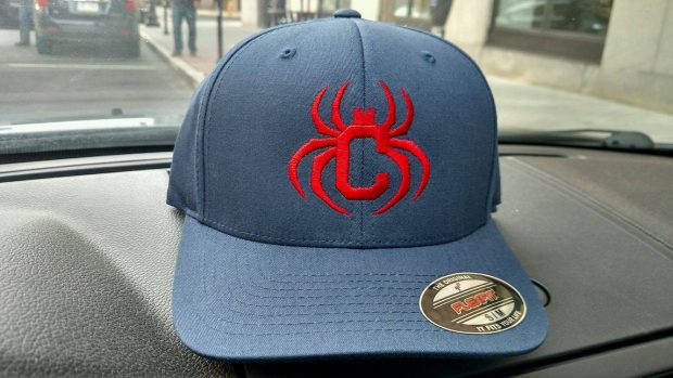





Weird, eh? But seriously, I just came across your page with the Spiders log and I think it’s fantastic! I agree with you, it’s time for a change. Great work, keep it up. I want a shirt.
Time to close the door on the Indians’ Chief Wahoo: …
I haven’t really seen any rebrands that make sense overall. Much of the major league logos out there are historic and simple, yet elegant. Your logo does that. It harkens to the history of the Indians plus rebrands in such a way it’s familiar to those outside Cleveland what it is. I would like to use this logo and do a rebrand article with your permission. This is genius level work.
Jason-
Permission enthusiastically granted! Please share a link with me once the article’s up, and thank you so much for the kind words!
Cheers,
Michael
I’d try an inline in the C to complete the actual C, incorporating the spider as part of the outline.
Love your design work on this . . .I’ve been yearning for this renaming to happen for years. Have always loved the branding and design possibilities. Have the stadium, or a section of the stadium called ‘The Web’, lots of web motifs all around the stadium. Tie ins with Spiderman (play the theme to the old Spiderman cartoon over the PA, have the racing hotdogs break through a web instead of the tape at the end, etc.). And how hard would it be to come up with something around the phrase ‘catching flies’? If the team ever got a dominant closer, they could be monikered “The Black Widow”. There are countless possibilities . . . here’s hoping this is the direction the organization goes, and further that you might be engaged on the uni design . . .really think yours looks sharp, classic, and good on screen and in person.
This is a really sharp, classic look. The word mark and uniform looks like it’s been around for 100 years, but the hat is new and cool and would sell like hot cakes. Awesome!
Absolutely love the uniforms!
Don’t like the half-C, half-spider logo on the hat, though.
I think of baseball as a more conservative sport in terms of logos, uniforms, nicknames, etc. I think that logo is a little too edgy.
I’d stick to either some form of a C…maybe just the Block C, or follow the previous Indians hat where it was just Chief Wahoo and make the hat just a spider.
Love that uniform, though!
The ABSOLUTE BEST Spiders design I’ve ever seen, amazing work! Sorry if you’ve already addressed this, but are t-shirts still available? I ordered a cap and can’t wait to wear it. Thanks!
Thank you so much, David! We’ll likely be bringing shirts back soon – does the red shirt/blue C logo appeal, or would a different design, say something with the Spiders wordmark, be more appealing?