Hey friends! First the short version, then the long version.
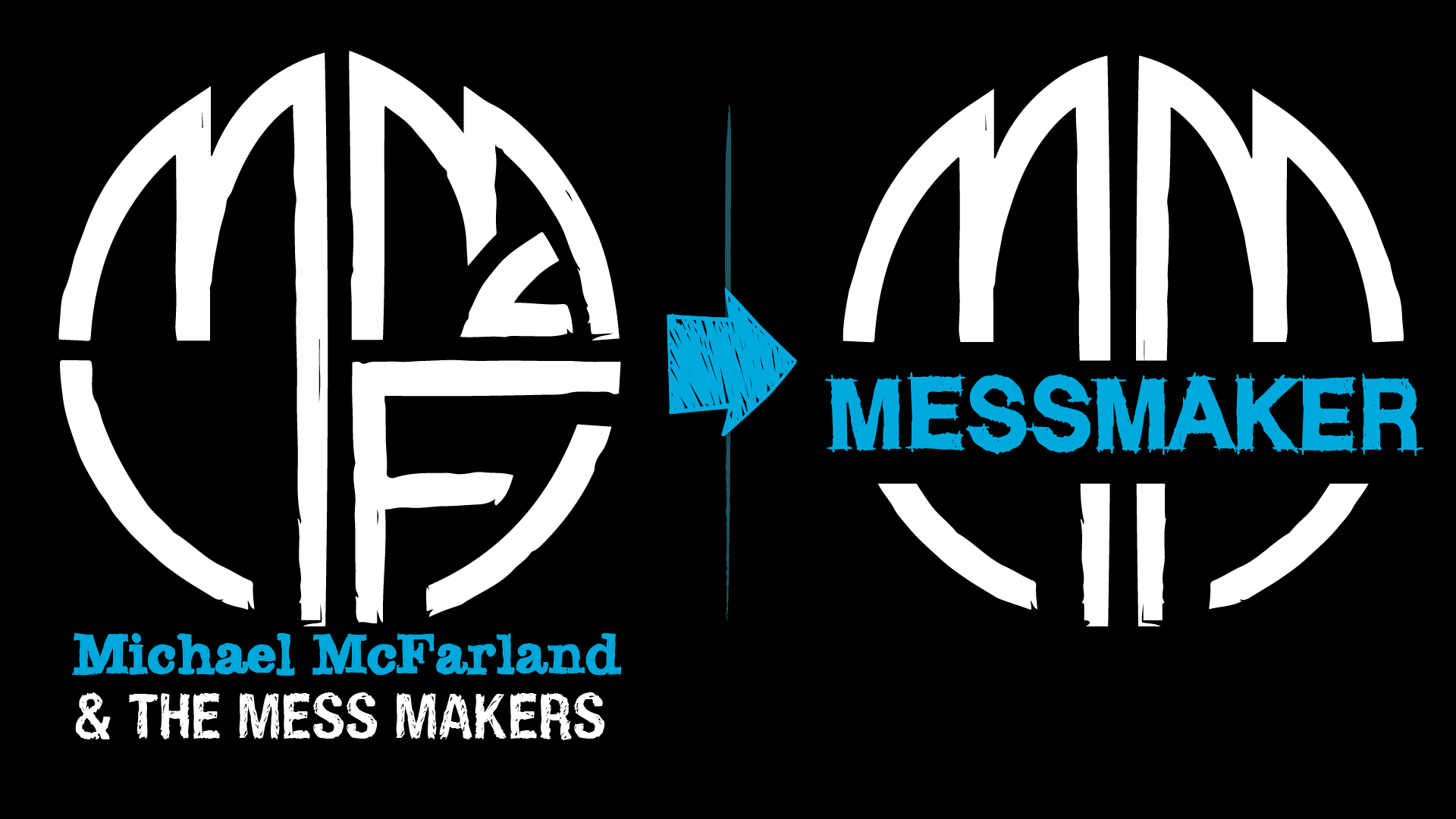
SHORT VERSION: Moving forward, I’ll be releasing music under the name MESSMAKER, and performing my original music under that name as well – often with co-conspirators. If you see a show billed as “Michael McFarland”, it’ll probably be a few hours long, and there’ll be lots of covers mixed in along with the live-looped originals. If it’s billed as MESSMAKER, get ready for a rock show!
I’ve got just one favor to ask: New name means that some of the social accounts are starting from zero. If you could give MESSMAKER a follow on Instagram, Youtube, and Spotify, that would mean the world, not just to me personally but also in building stats as a performer looking for opportunities. I’ll drop links below.
LONG VERSION: This decision was a long time in the making. Maybe it started when I titled my first EP “Michael McFarland Made a Mess”. Maybe it was in the Muni lot before a Browns game with Kevin & Gary, when the idea of calling my backing band The Mess Makers arose (moments before Gary referred to the flocking seagulls as pigeons). Maybe it was when I started getting offered lots of opportunities to play longer sets at restaurants, breweries, and wineries, and found myself stumbling over explanations like, “oh, yeah, this is going to be a chill show, sit down, have some drinks, I’ll bring the groovy tunes. The show NEXT Friday, though? I’ll be stackin’ bangers.”
But really, the tipping point came a few months into COVID lockdowns, when I holed up in the studio and dropped all the preconceptions of what kind of music Michael McFarland writes, records, and performs. I ended up with a 6-song EP called “Through This Fire” that didn’t really sound like most of the music I’d written before; at some point in the mixing process, Eric texted me the realization that there was not a single acoustic guitar on the record. Some creative tectonic plates had shifted, and a change was inevitable.
The further I’ve gotten into making music, the less it’s been a one-man-show – even if it often looked that way in live performances. Eric plays the drums on the records (and sometimes on stage), as well as co-producing and mixing the songs. All the new material that’s on the way – and hot damn, am I excited about what’s next – was co-written with my good friend Steven Charles down in Nashvegas. I share demos of every track with Amanda, Freja, Kevin, and Eric, and their feedback shapes the songs as they evolve into what eventually makes it to your ears.
So there it is. If you go to your favorite streaming services, you’ll now find “Through This Fire” under the new name MESSMAKER. All the older releases are still under the name Michael McFarland, and that’s where they’ll stay. That doesn’t mean that MESSMAKER will never play any songs from that back catalog – in fact, you can expect reimagined versions of some of those songs to drop soon under the new name!
I’ve got just one favor to ask: New name means that some of the social accounts are starting from zero. If you could give MESSMAKER a follow on Instagram, Youtube, and Spotify, that would mean the world, not just to me personally but also in building stats as a performer looking for opportunities. I’ll drop links below.
Thanks so much for joining me on this journey – we’re just getting started!
Cheers,
Michael McFarlandMESSMAKER


 ‘m going to keep this short, because there’s one big piece of news:


 The comparatively-balmy weather came in handy this past weekend, as March 1 was the day “MYTBYA Video Shoot” was on my calendar. I’ll give you 3 guesses as to what MYTBYA stands for…

 Over the past 6 months I’ve been thrilled to be supplementing my solo shows with full-band performances as Michael McFarland & the Mess Makers – playing with a full band is just so. much. fun., and the gentlemen I get to share the stage with are both a blast to be around and a pleasure to collaborate with. We’ll be playing our next show on


 At the Michael McFarland & the Mess Makers show last month, the very talented guitarist Tyler Ray from bands like