New EP "Through This Fire" : Listen on Spotify | Order CD

Blog

Artist Profile: The Lone Wolf Project

Artist:

The Lone Wolf Project (Philip Nathaniel Freeman)

Sounds like:

A dude with some incredible pipes and some nasty blues influences dealing with his demons while doing dirty things to an acoustic guitar.

How I discovered:

The Lone Wolf Project’s latest record, “Old Words, New Chapters“, was produced by Jason Rubal, who also produce my latest record. In the pre-production process, Jason and I were discussing the polished-yet-organic feel I wanted to aim for, and he told me to check out the work he’d done with Phil. He pointed me towards this video:

I was immediately hooked. You have to watch the whole thing, if only to make sure you catch the vocal leap at the 3 minute mark.

Favorite tracks:

The Arrival
The Right to Remain
The Bridge

Find’em online:

http://www.thelonewolfproject.com/
https://www.facebook.com/LoneWolfProject
http://www.youtube.com/lonewolfprojectmusic
https://twitter.com/lonewolfproject

Leave a comment

Music Competitions, Battles of the Bands, and Hoping For the Worst

Music Competitions, Battles of the Bands, and Hoping For the Worst – From The Mind of McFarland music blog.

Title/alt tag: music competitions, battles of the bands, hoping for the worstA few weeks back, I posted a link to a video answering the question of “what would happen if John Lennon had done a blind audition on The Voice?” He sings “Imagine”, and is selected by none of the judges – they give him “helpful” advice about changing the key of the song to better show of his range, song selection, etc. The video ended with a “next time on The Voice” showing a clip of the judges cringing while Bob Dylan sings. That video has since been pulled down due to copyright infringement claims (due to the use of live footage of John Lennon’s performance), but it got me thinking about everything that’s wrong with music competitions and battles of the bands, and why I decided about a year ago that I would no longer participate in them.

I’m not referring just to competitions like The Voice, The X Factor, American Idol, or any of those, though I certainly won’t be auditioning for any of them – I’m referring to any event that pits musicians against one another. Whether it’s battles of the bands, songwriting competitions, open mic contests, or “vote for me to play this festival” online popularity contests, I’ve discovered that all of these twist my perspective in ways that cause me to dislike myself in the mirror.

See, I’m a pretty competitive guy. When I compete, I like to win. And that means that in any competition of this sort, I’m always hoping for the worst for my fellow competitors – that they’ll have an off night, that they’ll play poorly, that they’ll forget the words of their songs, that a string will break. Hoping for the worst, especially when the people I’m competing against are friends, is one of the last things that I want to do.

So here it is – I pledge to not participate in any music competitions. You will not see me asking for your votes for any competitions. If you want to support my music, ask a friend to check out my new record, or check to see if anyone you know lives near any of my tour stops.

Let’s make the future of music be about building up the things we love, not hoping for the failure of others.

-MMcF

Leave a comment

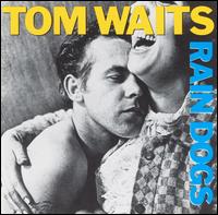
All Time Favorite Albums: Tom Waits – Rain Dogs

all time favorite, tom waits, rain dogs

All Time Favorite Albums: Tom Waits – Rain Dogs – From The Mind of McFarland music blog.

Sometimes an album catches you at exactly the right moment. If you were to hear it on any other day, in any other situation, you might not care for it, but given the proper set of circumstances, it can become one of your all-time favorite albums.

“Rain Dogs” by Tom Waits is a perfect example of this sort of album, that not only made me fall in love with the CD, but led to me becoming a fan to the point where if anyone asks my favorite musician, I will without hesitation reply, “Tom Waits”.

This collection of songs sat dormant on my Macbook’s hard drive for the better part of a year before I heard it. It was late 2006, and towards the beginning of that year I had visited my sister in Albuquerque, New Mexico. It was an innocent time, when young people freely swapped mp3 files without a thought to copyright infringement lawsuits, or perhaps just to piss off Lars Ulrich, and so when I left New Mexico my iTunes library just happened to contain a number of previously-not-present albums, and this was one of them. I knew nothing of Tom Waits – I had heard the name mentioned a few times, and in retrospect I recall hearing a few of his songs, but if you asked my opinion of him as an artist you would have been met with a blank stare. I mentally filed the album under “listen to it when I’ve nothing better to do” and forgot about it.

Fast forward to December. I’m working on finishing up my BFA in Visual Communication Design at Kent State University, pulling my third all-nighter in a row. I know I can’t allow myself to be anywhere near anything resembling a bed, so I’m at the Art Building, in the Glyphix Studio (Glyphix is a student-staffed, on-campus design studio). It’s 3:00 in the morning, the only light is the bright glow of my stations’ PowerMac display, supplemented by my MacBook Pro. As I work feverishly on a now-long-forgotten project, Thursday’s “War All the Time” album keeps me company. The last chord of the song Tomorrow I’ll Be You fades away to silence…

…and the most jarring sounds start emanating from my laptop. Clanking, rattling and stomping, held together by a drunken upright bass. I hear a voice made of crushed gravel croaking out what sounds like a demented song from a Disney cartoon. “We sail tonight for Singapore. We’re all as mad as hatters here!”

“This is it,” I thought. “I’ve finally pushed my body and mind past the point of exhaustion, and now I’m hallucinating.”

It took me a few minutes to regain my balance, mentally, and by that point “Singapore’ had given way to the creaky dirge Clap Hands. From there on out I was hooked, and it quickly became one of my all time favorite albums. There are 19 tracks on the CD, and I won’t skip a single one of them, but Jockey Full of BourbonGun Street Girl, and Walking Spanish are some of my favorites.

Though Tom Waits is one of my favorite musicians, his influence may not be obvious in my music, but I’ll let you in on a secret – the use of the mbira (African thumb piano) in Remember Me was directly inspired by the clanking and clinking noises in Clap Hands.

 Track 3 from my record “A Failed Breakup”: Remember Me

Check out my whole record here, or Tom’s here.

-MMcF

———————-

Unleaded rhythmic alt-pop fuels singer/songwriter and two-wheel troubadour Michael McFarland’s engine. Michael McFarland in the simplest summary? Writer, Rocker, Biker, Geek.

For Michael’s Music, Cd’s, Downloads, Merchandise, live show schedule, music blogs, music videos, and everything else you want to know about McFarland, visit the Michael McFarland Website at http://michaelmcfmusic.com/


Tagged , , | Leave a comment

Clan McFarland Profile: Melissa Bode

What’s your name?
Melissa Bode

Where do you live?
Wooster, OH

When/where/how did you first hear Michael McFarland’s music?
When he started advertising for the ‘Failed Breakup’ preorder, I started listening to all the songs on the past cd’s through his website and instantly liked the style of music as well as the lyrics.

What’s your favorite Michael McFarland song?
A Failed Breakup – …because it is unique, well written, the music is catchy… and i love it a lot.

Have you ever seen Michael perform live? If so, when/where?
I attended some of his shows in college, but more recently, the show at the Outpost in Kent, where the songs I already loved sounded even better live and I got to hear a few of the new ones.

What toppings would you like on your pizza?
Ham and Pineapple

What’s your favorite movie?
I honestly can’t say that I have a favorite movie. There are several comedies that I will watch again and again, but my favorite genre is mystery, and those get boring if you know the endings. But really there’s no movie that I don’t find entertaining.

How many fingers am I holding up?
31.
I’ve watched his counting in binary video blog… figured it couldn’t possibly have been 10 or less…

Apart from Michael McFarland, who’s your favorite musician?
The Lumineers, Hunter Hayes, David Cook

Rock, paper, or scissors?
Usually rock, with some scissors thrown in on occasion.

Michael threw Paper this time, so we’ll call it a draw.

Leave a comment

Favorite Music Video – My Creative Inspiration

Favorite Music Video – My Creative Inspiration – From The Mind of McFarland music blog.

favorite music video, creative inspirationI love making music videos – starting with a concept, taking creative inspiration from a song, building a visual representation or augmentation of a sonic idea. At this point I’ve been involved in the creation of six music videos (four of which were for my own music, or projects I’ve been involved with) and am currently in the planning phase for two more. I’ve never gone into a music video project with the idea that a video will magically “go viral” and the associated song will become an overnight sensation, but rather with the idea that a well-crafted video can greatly enhance the appreciation of a piece of music. I arrived at this idea from my favorite music video: “Warning” by Incubus.

Every time I’ve started developing a concept for a music video, I’ve had this one in the back of my mind. The creative inspiration for the video isn’t hard to surmise – it’s derived from the lyric, “She called out a warning/Don’t ever let life pass you by”. This one line was expanded into an entire narrative, which, after watching the video, is impossible to divorce from the song itself.

For every music video I’ve had a major part in creating, that became my aim – to create something that forges such a memorable connection to the song, that once seen, the two can not be separated.

Sit and Wait

My most recent music video project – the creative inspiration for this one came from the line “So I’ll sit here ’til the morning/Yeah, if that’s what it takes/’Til the sunlight meets my silence/In the dawn as it breaks”. It was conceived of, shot and edited in the course of three days. The reverse time-lapse idea hit me at about 2:00AM, just 4 hours before I started shooting – and yes, all the timestamps are accurate.


Bottle Rocket

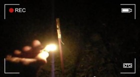
The concept for this music video actually preceded the song. On new years eve, I was shooting bottle rockets off my front porch, and the idea that each rocket represented something I wanted to let go of hit me, and I couldn’t let go of it. I wrote the song as a vehicle for the idea, and put together an event where my friends could share in this wonderful catharsis.


Start to Begin

The script for this one was written by my good friend R.L. Shaffer – I’d presented him with a basic concept of two timelines diverging and re-combining, describing it to him as “A little bit of Sliding Doors, a little bit of the split-screen scene from Rules of Attraction, and a little bit of Terminator. Because, no matter what choices you make, you can’t stop judgement day.” He came up with a script that hit far closer to home with what the song was written about than I’d anticipated, which, it turned out, was exactly what was needed.


Hail, Hail (The Bride’s In Jail)

From my now-on-geographical-hiatus band Aviatik, this video was the first I helped put together, pulling creative inspiration from the line “Shotgun wedding while your best friends hang”, and the idea that places hold the echoes of events that happened there in the past.


I plan to start shooting (and collecting!) the footage for my next music video this coming week, while on vacation in Cape May, New Jersey. I’ll let you guess for which song off my new record it might be…

-MMcF

———————-

Unleaded rhythmic alt-pop fuels singer/songwriter and two-wheel troubadour Michael McFarland’s engine. Michael McFarland in the simplest summary? Writer, Rocker, Biker, Geek.

For Michael’s Music, Cd’s, Downloads, Merchandise, live show schedule, music blogs, music videos, and everything else you want to know about McFarland, visit the Michael McFarland Website at http://michaelmcfmusic.com/

Leave a comment

What Would Brian Boitano Do? Making Plans & Following Through

What Would Brian Boitano Do? Making Plans & Following Through – From The Mind of McFarland music blog.

What would Brian Boitano do if he were here right now? He’d hit unexpected objects to make percussive sounds and record them. Why? Because he’s all about making plans and following through.

If that makes absolutely no sense to you, it’s probably because you’ve never watched the South Park: Bigger, Longer, and Uncut film. To catch you up on the conversation, here’s a video:

Ok, now that you’re back with us, with a full understanding of what making plans and following through has to do with Brian Boitano, I’ll proceed.

Right now I’m at Seventh Wave Studios in Harrisburg, Pennsylvania, and I’ve completed day 1 of a two-week process to record two EPs with producer Jason Rubal. I’ve been waiting for over a year to record a lot of these songs – road testing them out on tour all over the United States, figuring out which songs were ready for primetime, which needed work, and which needed to be round-filed (that’s a trash can, in case you missed it. Please do try to keep up! :-D). I’ve had a vision for the “sound” of these records for even longer than that, though.

If you’ve never seen me play live, I hit my guitar a lot. I beat on the body of it, and loop those percussive sounds to make the backbeat rhythms for my songs. I started performing this way shortly after moving from Kent, Ohio to Asheville, North Carolina. See, in Kent I had a full backing band, but post-move I was on my own, and for the sake of touring I didn’t want to try to assemble a new band, but rather to find the best way to do it solo. My previous record, Waking Up Is A Letdown, was recorded with a full band in mind. This time around, I knew it was going to be just me, so I wanted the sound of the record to, while not being an exact replica of my live show, have a direct correlation to what you’d see if you saw me perform.

What does that mean? No conventional “drum kit” drumming, for one.

I recall a conversation with my sister, while visiting her country house in Fatima, Brazil, where I told her about the vision I had for my next record. “I have this idea of using organic loops – I’ll find objects that give me the percussive sounds that I want, record those rhythms, and then loop them. I don’t want to use any pre-recorded samples, for the same reason I’m not using a drum machine on stage – creating those sounds is an integral part of the performance.”

And that’s exactly what’s happening.

what would brian boitano do, making plans, following throughTonight & tomorrow, I start following through on that plan. Jason & I will be auditioning all kinds of different objects to see how they sound when miked, and figure out which will be right for each song. Because that’s what Brian Boitano’d do.

And in case you missed it, you can pre-order the first EP now! Because that, also, is what Brian Boitano’d do.

-MMcF

———————-

Unleaded rhythmic alt-pop fuels singer/songwriter and two-wheel troubadour Michael McFarland’s engine. Michael McFarland in the simplest summary? Writer, Rocker, Biker, Geek.


For Michael’s Music, Cd’s, Downloads, Merchandise, live show schedule, music blogs, music videos, and everything else you want to know about McFarland, visit the Michael McFarland Website at http://michaelmcfmusic.com/

Leave a comment

“Pay What You Want” EP Prerelease Announcement: A Trust Fall

“Pay What You Want” EP Prerelease Announcement: A Trust Fall – From The Mind of McFarland music blog.

I’m about to try something that may end up being a terrible idea. I’ve decided to, at least for the moment, price digital prerelease orders of my next EP using a “Pay What You Want” structure starting at just $1. Why, might you ask? A trust fall.

First, an admission: I have trust issues. I’ve always found it difficult to put my fate in the hands of others. That’s the reason that up until now, I’ve always produced, engineered, mixed and mastered my own records. In fact, it’s the reason that I learned audio engineering in the first place – after a few bad early experiences, I wasn’t willing to place my music in the hands of someone else and believe that they would treat it with the same kind of attention and care as I would give it myself.

Over the past year, I’ve tried to make a point to have more faith in people. I concluded when I started booking my first national tour that if I had to pay for a hotel every night, touring would not be financially feasible. I booked the dates anyway, and threw myself on the tender mercies of the Internet, humbly asking for a place to stay on my usual social media networks and on Couchsurfing.com. I was astounded and humbled by the number of people, most of them complete strangers, that offered up their couches, spare bedrooms, and floors to me. That was step number one.

When it came time to record my next album, I decided that doing all the audio engineering work no longer made sense, and so I reached out to Jason Rubal, who I’d met at the Singer-Songwriter Cape May conference last year. After a few conversations over the phone in January I felt confident that he was someone who understood where I was coming from creatively, and someone with whom I could entrust my music, so I made the decision that he would be my creative partner in this process. That was step number two.

So now pre-production is complete, and in two weeks I’ll be heading to Harrisburg, Pennsylvania, to spend two weeks in the studio with Jason. We’ll be recording two five-song EPs, one for release in the spring, another in the winter. And without having begun recording, I have complete confidence that once finished, these will be the best things I’ve ever recorded. As someone who’s always a been a seeing is believing kind of guy, that’s a big statement.

Which is why I decided to make the first of these two EPs, “A Failed Breakup”, available for pre-purchase now. Before a single note has been played, a single drum head has been struck, or a single melody sung. And since your purchase would be, in itself, an act of faith, I thought it was a good opportunity to once more put my trust in others, and let you pay what you think the music’s worth. To that end, you can pre-order now for just $1, or pay as much extra as you’d like.

This is a trust fall. I hope you’ll catch me, and it won’t end up like this:

1 Comment

Burn The Fleet! Tour Planning, Hernan Cortés, & the Point of No Return

Burn The Fleet! Tour Planning, Hernan Cortés, & the Point of No Return – From The Mind of McFarland music blog.

burn the fleet, tour planning, herman cortes, point of no returnIn three weeks I’ll be making the trek to Harrisburg, Pennsylvania for the better part of a month, to record two EPs with internationally acclaimed producer Jason Rubal. Once that’s all done, there will be the customary hullabaloo associated with an album release: release parties, press releases, I may release a flock of doves – so long as it has the word “release” in it, by golly I’m going to do it! That’s all still a ways off, though. Yesterday, however, I decided to proverbially burn the fleet, Hernan Cortés style, and release the preliminary tour routes I’ll be undertaking within the next twelve months. Why? In-N-Out Burger.

Let me explain.

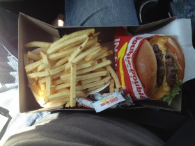
In-N-Out Burger & Fries

OM NOM NOM!

When I was on my 45-day 2012 summer tour, which took me from Asheville to Chicago, Minneapolis, Austin, San Diego, Portland, Denver, and all points in between, I got to experience In-N-Out Burger for the first time. For those not familiar, In-N-Out is a California chain of fast food restaurants, which, believe it or not, has some of the best burgers you will ever taste. In the four days I as in California, I succeeded in eating this ambrosia of the quick service gods four times. It’s really that good.

So yesterday, I happened across this article in the Huffington Post about an In-N-Out Burger cook who opened himself up for questions in a Reddit “Ask Me Anything” session. His descriptions of some of the off-menu items, made by the cooks for their own enjoyment during off-hours, often requiring additional ingredients brought from home, awakened a fierce craving. Unfortunately, the nearest In-N-Out Burger is 1,916 miles away, in Tucson, Arizona.

Something had to be done!

When undertaking significant tasks, I’m often reminded of Hernan Cortés. In case your memory of the Spanish conquest of the Aztec empire needs a refresher, Cortés was a conquistador perhaps best known for a tactical decision he made, when murmurs of mutiny were spreading through his troups: He ordered his fleet scuttled (it should be noted that, in spite of the title of this blog, he did not actually burn the fleet… but I prefer the drama that image provides.), on the pretext that they were no longer seaworthy. With the possibility of turning back removed, the only option was to go forward. A mutiny would still leave everyone involved stranded in Mexico.

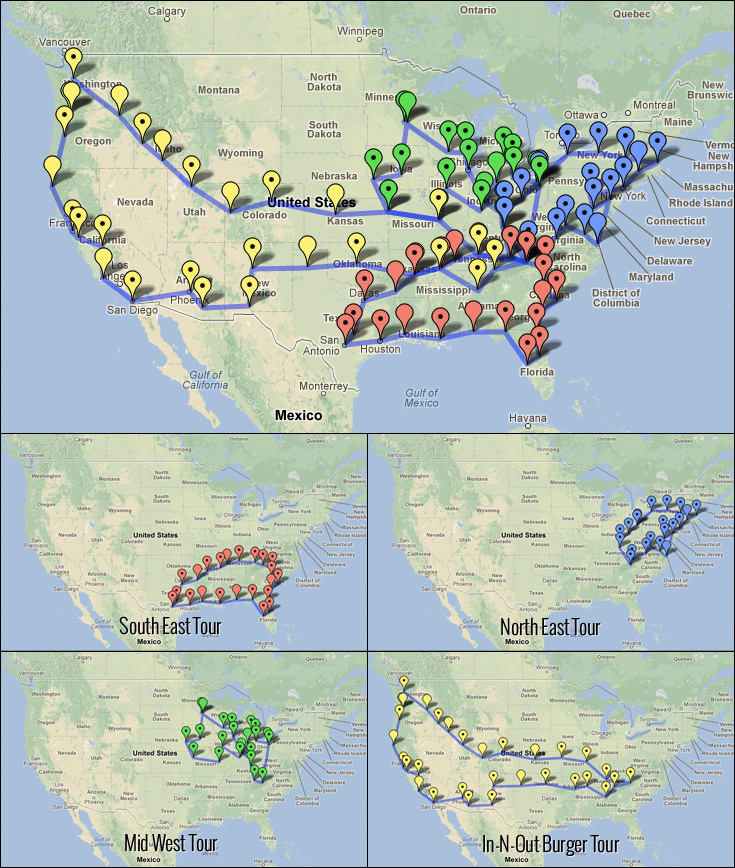
What I’m about to do is kind of like that. I’ve been told in the past you should never announce big plans until you’re absolutely sure they’re going to happen, lest you appear to be promising things you can’t deliver. I prefer the tactic that my sister Marnie explained to me when I was helping her on her way to her new life in Manaus, Brazil. “When there’s something I really want to do, but am afraid to, I force myself into a situation where I have no other options.” So here it is. The final form of these tours may not be exactly what these initial routes show, but you can expect them to be close. If you happen to live near any of these markers and can help me out with booking a show or giving me a couch to crash on, please let me know!

The fleet is in flames. It’s time to move forward.

Michael McFarland - 2013 Tour Routes

[click for full size]

-MMcF

Complete City List

2013 Tour A: Southeast – 22 days, ~3200 Miles

Day 1: Asheville, NC
Day 2: Charlotte, NC
Day 3: Columbia, SC
Day 4: Charleston, SC
Day 5: Savannah, GA
Day 6: Jacksonville, FL
Day 7: Orlando, FL
Day 8: Tampa, FL
Day 9: Tallahassee, FL
Day 10: Pensacola, FL
Day 11: New Orleans, LA
Day 12: Lake Charles, LA
Day 13: Houston, TX
Day 14: San Antonio, TX
Day 15: Austin, TX
Day 16: Dallas, TX
Day 17: Texarkana, TX
Day 18: Little Rock, AK
Day 19: Memphis, TN
Day 20: Jackson, TN
Day 21: Nashville, TN
Day 22: Knoxville, TN

2013 Tour B: Northeast – 21 days, ~2650 Miles

Day 1: Asheville, NC
Day 2: Johnson City, TN
Day 3: Roanoke, VA
Day 4: Staunton, VA
Day 5: Richmond, VA
Day 6: Norfolk, VA
Day 7: Philadelphia, PA
Day 8: Baltimore, MD
Day 9: Harrisburg, PA
Day 10: New York, NY
Day 11: Hartford, CT
Day 12: Boston, MA
Day 13: Portsmouth, NH
Day 14: Albany, NY
Day 15: Syracuse, NY
Day 16: Buffalo, NY
Day 17: Akron/Kent, OH
Day 18-19: Kent, OH
Day 20: Columbus, OH
Day 21: Cincinnati, OH
Day 22: Lexington, KY

2013 Tour C: Midwest – 24 Days, ~3450 Miles

Day 1: Asheville, NC
Day 2: Canton, OH
Day 3-4: Kent, OH
Day 5: Bowling Green, OH
Day 6: Ann Arbor, MI
Day 7: Lansing, MI
Day 8: Fort Wayne, IN
Day 9: Bloomington, IN
Day 10: Peoria, IL
Day 11: St. Louis, MO
Day 12: Kansas City, MO
Day 13: Omaha, NE
Day 14: Des Moines, IA
Day 15: Minneapolis, MN
Day 16-17: St Paul, MN
Day 18: Madison, WI
Day 19: Milwaukee, WI
Day 20: Chicago, IL
Day 21: Indianapolis, IN
Day 22: Cincinnati, OH
Day 23: Lexington, KY
Day 24: Knoxville, TN

2013 Tour D: West Coast – 30 Days, ~6500 Miles

Day 1: Asheville, NC
Day 2: Chattanooga, TN
Day 3: Birmingham, AL
Day 4: Memphis, TN
Day 5: Little Rock, AK
Day 6: Oklahoma City, OK
Day 7: Amarillo, TX
Day 8: Albuquerque, NM
Day 9: Las Cruces, NM
Day 10: Tucson, AZ
Day 11: Phoenix, AZ
Day 12: San Diego, CA
Day 13: Santa Barbara, CA
Day 14: Fresno, CA
Day 15: San Jose, CA
Day 16: San Francisco, CA
Day 17: Eureka, CA
Day 18: Eugene, OR
Day 19: Portland, OR
Day 20-21: Portland, OR
Day 21: Seattle, WA
Day 22: La Grande, OR
Day 23: Boise, ID
Day 24: Twin Falls, ID
Day 25: Salt Lake City, UT
Day 26: Grand Junction, CO
Day 27: Denver, CO
Day 28: Hays, KS
Day 29: Kansas City, MO
Day 30: St Louis, MO
Day 31: Nashville, TN

———————-

Unleaded rhythmic alt-pop fuels singer/songwriter and two-wheel troubadour Michael McFarland’s engine. Michael McFarland in the simplest summary? Writer, Rocker, Biker, Geek.

For Michael’s Music, Cd’s, Downloads, Merchandise, live show schedule, music blogs, music videos, and everything else you want to know about McFarland, visit the Michael McFarland Website at http://michaelmcfmusic.com/

4 Comments

Rebranding Roller Derby: Athletics Logos and Sports Design

READ THIS FIRST!

Some feathers may be ruffled and some feelings hurt by what I’m about to say about the need for rebranding in the world of roller derby, so before we get into all this, let me clarify a few things.

1. I am a fan of roller derby

I’ve been a regular attendee at roller derby bouts for several years. I’m not a fan of roller derby because I have lots of friends who play (I do) or because I’m dating a derby girl (I am), but because I genuinely enjoy the sport. When I still lived in north east Ohio I never missed a bout by the Burning River Roller Girls, and often made it to Rubber City Rollergirls and NEO Roller Derby bouts as well. Since moving to Asheville, NC, the only home bouts I’ve missed were when I was on tour, or out of town for another reason. I made the trip to Atlanta for championships last year. I screamed myself hoarse for Sandrine Rangeon in the bronze medal match, and teared up when she won 2012 MVP jammer.

2. I am a professional branding consultant

When I’m not being a touring singer-songwriter, my mild-mannered alter-ego is a professional graphic designer and branding consultant. I received a 5-year degree in Visual Communication Design from Kent State University. I have paid the bills for the past 7 years running my own company (yes, shocker, playing music is not yet paying the bills. Okay, it’s paying my cell phone bill. Next goal: make enough money from playing music to pay for cell phone AND motorcycle insurance). I do, however, try to keep the two sides of my life separate, I’m not trying to parlay this into additional business, and I prefer this forum over my business’s website for a personal soapbox, so I won’t link to my professional portfolio here.

3. I’m doing this because I care

This is is the friend who, when you’ve been trying for hours to get your motorcycle to run right, says “maybe you should have a mechanic check that out.” This is the teacher who grades your work and points out what you did wrong because he wants you to do better. This is an intervention. I’m not trying to be condescending, snarky, or mean, and if you belong to one of the leagues I mention here, the inclusion means that I’ve paid enough attention to have noticed, and I’ve probably cheered for your team. I would never think of trying to tell you how to skate, but this is something that I know about. I’m here to help.

Okay, let’s get started!

With all that out of the way, it must be said that roller derby as a whole has a lot of problems with branding. Take a look through the WFTDA Member League list and you’ll quickly see some of the issues. One of the biggest is that a good 50% of the logos are entirely illegible at that thumbnail size. The reasons for the branding issues are myriad, but if I were to hazard a guess, I’d say it’s because most of them were designed in-house at the league. In my experience, roller derby leagues tend to contain a lot of talented, creative people, often including some fantastic artists. Unfortunately, there’s a world of difference between a great tattoo design (which a lot of these logos look like) and a successful branding/identity system.

Why does it matter?

In a word, credibility. Roller derby is still an emerging sport, striving for respect and recognition in the athletics world. I’ve heard many friends who play roller derby wishing that the championship bouts were covered in some way on television. I hate to be the bearer of bad news, but even producers at EPSN 8 (“The Ocho”) would look at most of these logos and say, “There’s no way we can use that on air.” If roller derby as a sport wants to be taken seriously, the member leagues need to look professional – I use the term in the “having your act together” sense, not the “getting paid” sense – and when your first impression is a logo that does not look like it belongs to a serious athletic organization, then the battle’s already lost. With a small business, there’s a time when, if the business wishes to continue growing and reaching a larger market, they have to move past their in-house designed logo to something that looks like they’re ready to play in the big leagues.

For roller derby, that time has come.

Cool, so we need to redesign our logo?

This is the first preconception that needs to be squashed. A logo does not a branding system make. A logo is one piece of a branding system. Just like Froot Loops are part of your complete breakfast, you still need the apple, the glass of orange juice, the bran muffin and the milk. A branding system is a complete kit of parts that can be used in any situation the organization needs to be visually represented.

I’ll use the recent rebranding of the Erie Seawolves (The Double-A Minor League Baseball affiliate of the Detroit Tigers) as an example.
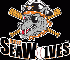
Before
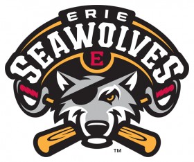
After


The improvement is immediately obvious – one looks like a page from a bad coloring book, the other looks like a professional sports team. But the one logo wasn’t all the Seawolves got. Check out this picture from when they announced the rebranding:
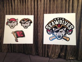
And I’m sure they also have a graphic that’s just the “Erie Seawolves” text, and a set of brand guidelines on how/where the graphics are to be used, the amount of space to allow around the elements, and a complete color palette for use in promotional pieces. In addition, each of the individual elements are set up to look good on dark or light backgrounds (which is important to note – WFTDA requires that leagues competing in playoff and championship tournaments have both light and dark uniforms).  Now head over to their online store, and check out how all those different elements are used:

Erie Seawolves New 2013 Merchandise

Starting to get the picture? You may have to spend some money at the beginning to get a complete branding system, though it’s entirely possible that you could find a consultant or firm willing to do the work in trade for tickets or sponsorship. It’s money that’s well worth spending to look professional and have graphics ready to go for any application.

[Editor’s note 03/10/2016: If you want a great article about this subject that’s less likely to make you mad, check out “How to Brand a Roller Derby League” from Rainy City Roller Derby. It does an excellent job of laying out the totality of what a branding system is, and how to get there.]

Got it. So what’s wrong with the current league logos?

The same things that were wrong with the first 30 or so logos I designed in my Corporate Identity class – a class I wasn’t allowed to take until halfway through my third year in the design program at Kent State. Even with all that background in design, I still made most every mistake in this list. Well, except for putting a roller girl in all my logos.

Legibility


No matter how great a piece of artwork may be, if you can’t understand what it’s trying to communicate when it’s shrunk down to the size of a quarter, it’s not a good logo. You want people’s eyes to be able to rest on your flyers, posters, or t-shirts for no more than a second, and be able to understand what’s being represented. There are a lot of things that go into legibility; line weight, type size, and clarity of form are some of the big ones.


Kitchen Sink
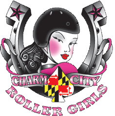
 
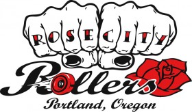
Trying to cram too many things into a logo is one of the biggest mistakes in branding and identity design. The Charm City logo has a horseshoe (presumably referencing the Preakness), a girl, a ribbon, a spade with the Maryland flag on it, and the name of the league, all presented in a traditional tattoo style. The Rose City logo has knuckle tattoos, a skate wheel as an “o”, a clipart rose and some script fonts. By trying to say too many things at once, they end up saying nothing.


Where’s The Roller Girl?
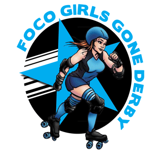
 

Going back through the WFTDA member league list, 101 out of 172 logos feature a roller girl in one way or another. That means that if your league’s logo has a roller girl in it, that’s a feature you share with about 60% of all the other leagues. If you’re going for an instantly recognizable design, doing the same thing that everyone else is doing isn’t the best way to achieve that.

Historically, there is a reason for this trend; when modern roller derby was just beginning to emerge as a legitimate sport, most people didn’t know much about it. The roller-girl-in-the-logo thing served to instantly explain that this is a sport involving tough women – thus all the black eyes, tattoos, and sneers – and roller skates. At this point, however, the sport’s grown beyond the need for that explanation. Even if they haven’t been to a bout and haven’t a clue about the rules, most people have at least heard of modern roller derby. They might not realize it’s happening in their town, but they don’t need a badass pin-up-style illustration of a derby girl on every logo to know what the sport’s about.


Hierarchy
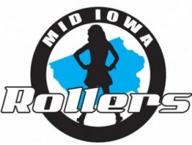
 

This is one that makes me shake my head every time I see it. “Rollers”, “Rollergirls”, “Derby Dames”, “Derby Dolls”, and all the other variations are not your league name. They are simply an indicator of what sport your league plays. They should not be larger than the name of your league.

Can you imagine what logos would look like in other sports if they all treated their hierarchy this way? As a Cleveland fan, I’d feel a little silly sporting this on a shirt:
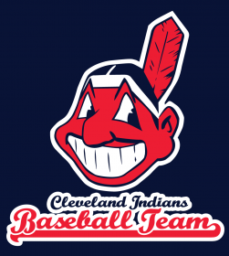
 

Uniqueness
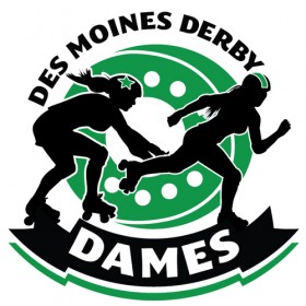
 

Though prime examples of the heirarchy issue I just mentioned, as far as visual execution these two logos are some of the better ones among the WFTDA member leagues. They’re clean, easy to read, scale down well, and would reproduce well in many different situations. Unfortunately, neither of them actually says anything about the team or where they’re from. Remove “Atlanta” or “Des Moines”, and would you have any clue where they were based? If your league name is your city, then your logo should pay homage to what’s unique about that city.


Rebranding Case Studies

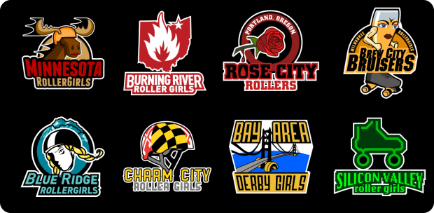
Just for funsies, I decided to redesign some logos. I did all these in an afternoon (though one I’d had most of lying around for a while), and didn’t spend more than an hour on each. My goal was simple: take 8 existing logos that had deficiencies, and redesign each to meet the criteria of Legibility, Heirarchy, and Uniqueness. The Kitchen Sink and Where’s The Roller Girl issues would necessarily be resolved by the necessity for Legibility and Uniqueness, so I didn’t feel the need to specifically require those.

I didn’t take the time to separate out the additional branding components, but using the SeaWolves example above, it wouldn’t be difficult to imagine how that could work with any of these.

Minnesota RollerGirls
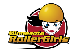
Minnesota Rollergirls Logo - Current

Before

Minnesota Rollergirls Logo - Rebranding

After

In spite of being graphically well-executed, the Minnesota RollerGirls logo falls short in the categories of uniqueness and heirarchy. There’s nothing about it that says “we’re from Minnesota.” You’ve got your standard black-eyed rollergirl, and the text emphasizes RollerGirls over Minnesota.

My solution? Mooses make everything better!

I’ve got lots of family in Minnesota, and apart from the bitterly cold winters, the two things that come to mind when I think of the state are lakes and moose. And moose are more fun to illustrate.

Is it goofy? Sure! But it’s also memorable. And if you think serious athletes can’t play for a team whose logo makes you grin a little bit, you need to check out some of these Minor League Baseball logos.

[Note: After I published this, it was pointed out to me that the moose I created was, in fact, a boy moose. Female mooses don’t have antlers like that. Whoops! It’s also worth noting that in the time since writing this article, Minnesota has been gradually rolling out brand updates, one of which includes using the shape of the state behind the logo.]

Charm City Roller Girls

Charm City Roller Girls Logo - Current


Before

Charm City Roller Girls Logo - Rebranding

After

I already spoke a little bit about this logo’s shortcomings – in addition the kitchen-sinkiness, it  also has a generic roller girl, some heirarchy issues, and some pretty terrible gradients.

When I started thinking about what I mentally associate with Charm City, the solution to this logo became instantly clear. If you’ve ever seen them skate, you know that it’s impossible to forget their helmets – they’re one of the most unique uniform elements in all of roller derby.

And if you doubt that a clean graphical execution of a helmet can be considered a logo, try heading over to www.clevelandbrowns.com.

Boom.

 Rose City Rollers

Rose City Rollers Logo - Current

Before

Rose City Rollers Logo - Rebranding

After

You can probably pick the issues out here – legibility on “Rose City”  goes away very quickly, there are too many disparate elements, “ROLLERS” jumps way out in the heirarchy, none of the elements work together stylistically. This one’s kind of a mess.

It was also one of the more challenging ones to find a solution for, and of all of these, it’s probably the one I’m least thrilled with the final result. Coming up with anything that didn’t look like a florist’s logo was difficult, and I’m not sure I succeeded in shaking that fully. I thought focusing on the rose element was the only thing that made sense, however, and a great American poet once told me that every rose has its thorn. Thorns make you bleed, blood’s red like a rose, and the blood drop from the thorn just happened to line up with the bowl in the “O”.

Burning River Roller Girls
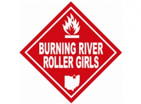
Burning River Roller Girls Logo - Current

Before

Burning River Roller Girls Logo - Rebranding

After

In the grand scheme of roller derby logos, the Burning River logo actually has a lot going for it. It’s unique – the two-color white/red execution is eyecatching, it relates to the history of the city (for those who don’t know, the Cuyahoga River caught on fire a few times back in the day, kickstarting a little thing called the environmental movement), and it’s instantly recognizable. Unfortunately, it falls into a special category of derby logos I call the “parody logos” – and in this case is a bit too literal in its aping of the hazmat “Flammable Liquids” placards.

This one was an easy fix – the “flammable” symbol is one that’s universally recognizable, so I just cleaned that up, layered it on top of Ohio, and separated out a type treatment for the logo.

Confession – I actually designed the main icon for this one a few years back, and screenprinted a few bootleg shirts for myself. When I wore one of those to the next bout, I had more than a few people ask me where they could purchase shirts with the new design.

Brew City Bruisers
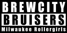
Brew City Bruisers Logo - Current

Before

Brew City Bruisers Logo - Rebranding

After

Well, at least this one’s legible…

This is another perfect example of a “parody logo”, but this time without any discernable reason for that parody. Brew City Bruisers is such a fantastic, evocative name, but instead it receives a “parental advisory” label treatment.

Sometimes, when I begin designing something, I get a flash of inspiration. It’s rare when that inspiration makes me laugh out loud. This logo is one of those rare cases. The moment I had the visual of an anthropomorphized pilsner glass in a roller skate, I cracked up. From there it was just a matter of transforming that mental image into a logo.

As with the Minnesota design – yes, it’s a little goofy. But it’s unique and certainly memorable.


Silicon Valley Roller Girls
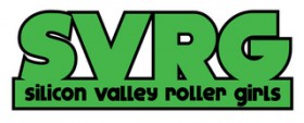
Silicon Valley Roller Girls Logo - Current

Before

Silicon Valley Roller Girls Logo - Rebranding

After

When I first started bouncing around the idea of writing this blog and doing this project, I was given a few suggestions of logos I should tackle for a re-design. This was one of those, and it’s not hard to see why – it’s lacking in any discernable character whatsoever. Unless people already know who you are, an acronym like SVRG is not going to set off lightbulbs over anyone’s head, so all you’re left with is some black text to tell you what this represents.

My solution on this one may be a little trite – a circuit-board rollerskate and some 8-bit text (in the same greens as the commodore 64 monitor I spent my early formative years learning BASIC on) – but it meets the criteria I set out for myself. Onward!

Blue Ridge Roller Girls
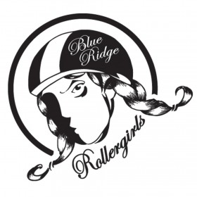
Blue Ridge Roller Girls Logo - Current

Before

Blue Ridge Roller Girls Logo - Rebranding

After

I debated whether to tackle this one, as it’s the team I most actively follow and root for (they’re based in Asheville, NC where I live), but I decided that it hardly seemed fair to criticize the logos of teams whose members I don’t personally know, and not do the same to my home team.

This is a case where I actually like having a roller girl in the logo – she’s recently been redesigned, and it’s a very well executed illustration, but still falls short in the areas of legibility (the Blue Ridge text all but disappears as it scales down – script fonts in general are difficult in that regard), the heirarchy’s off, and while the girl-with-the-braids has the potential to be iconic, it’s not quite there yet.

I decided this one just needed a sprucing up, not a full-on redesign, so I cleaned it up, tweaked the browline, put a gleam in her eye and some blue ridge mountains in the background. That’ll do!

[Note: Since the publication of this article, Blue Ridge hired me to update their logo. You can take a look at how that ended up on their website. No mountains, but a huge leap forward in legibility, and I also put together a complete branding package for them. I may add that to the article at some point.]

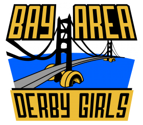
Bay Area Derby Girls
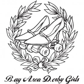
Bay Area Derby Girls Logo - Current

Before

Bay Area Derby Girls Logo - Rebranding

After

This was another request, suggested by a former San Francisco resident, who thought the “heels and wheels” logo said nothing about the bay area. That, and the fact that it becomes entirely illegible from any distance (I watched them skate at the championships and had no idea what the logo was supposed to be until I saw a larger version on their website), pushed this one onto the list.

The B.A.D. thing, while clever, doesn’t really work. When the crowd is singing “BAAAY AAAREEEAAAAAA” in support of your team, that’s what your logo should be showcasing. That and, you know, something about the bay.

Thus, the Golden Gate Bridge on rollerskate wheels. I tried using the bay bridge, but the towers of the Golden Gate are far more iconic, and since gold is the primary Bay Area uniform color, that subtle tie-in seemed to make sense as well.

There you have it!
Roller Derby Logos

I’m not trying to say that this is the direction these leagues should definitely go with a rebranding, or even that any of these logos is very good; conceiving of and executing a logo in the course of an hour isn’t likely to yield world-class results. Every one of these rebrandings, however, fits the self-assigned criteria of Legibility, Hierarchy, and Uniqueness, and every one could be used as the basis for a comprehensive branding system. More than anything, I’m trying to get people in the derby world thinking about their brand. I’ve got my fingers crossed that in the next few years we’ll see some major rebrandings of roller derby organizations.

It’s time to join the big leagues.

————————————

Edit: I just stumbled across another great blog on this same subject, that touches on a lot of additional nuances of team colors, the different sub-teams on leagues, and other issues that I didn’t get around to including in this. Check it out:
Roller Derby & Branding, or, We Love the Petty Stuff

Another edit: Since writing this article, I’ve had the opportunity to work with several leagues on developing their brands, including Blue Ridge Roller Derby, Cast Iron Skaters, and several other along the way. I did spend more than an hour on those logos!

18 Comments

Psych Study on Letting Things Go–Scientific Validity of Bottle Rocket?

Psych Study on Letting Things Go–Scientific Validity of Bottle Rocket? – From The Mind of McFarland music blog.

A few nights ago, I received a phone call from my father – not an entirely infrequent event, but calls from my parents are usually with a specific purpose, and not just of the “hey, I’d like to chat!” variety. So even though I was in the middle of the latest episode of Revolution (the midseason finale was fantastic, in case you haven’t been watching – the series is finally getting interesting!) I took the call. The conversation began with words that I frequently use: “So I was listening to NPR earlier…” He proceeded to tell me that he had been tuned into a Canadian public radio news show (“The one with all the puns?” “No.” “So it was Here & Now, not As It Happens”), and they were discussing a recent psych study published online in the journal Psychological Science.

The study revolved around the idea of letting things go, by mentally “tagging” them as worthy of holding on to, or worthy to be relinquished. You can read the full press release here, but here’s the short version. Students participated in a study where they were placed in three groups and told to write down thoughts, positive or negative, they had about a subject – in one instance it was about body image, another about a certain diet. The first group was then instructed to fold up what they wrote, put it in their wallet, and take it with them. The second group in the psych study was instructed to leave the paper on the desk. The third group was instructed to crumple up the paper and put it in the trash.

When later asked to give their thoughts about the subject again, the ones who had kept the paper in their wallet held strongly to the thoughts they put on the page. The ones who threw the paper away were unaffected by what they had written – as if they could mentally “start fresh” with a new set of thoughts on the matter.

For those of you who have seen my Bottle Rocket music video – an exercise in letting things go, in letting the past go, through the use of mildly illegal explosives – the relevance of this psych study should be obvious. What began in a fit of inspiration on December 31, 2010 now seems to have some scientific validity. And if letting go of the past by crumpling up a piece of paper and throwing it away is effective, how much more effective must it be to do so by watching those thoughts explode in a flash of light?

-MMcF
———————-

Unleaded rhythmic alt-pop fuels singer/songwriter and two-wheel troubadour Michael McFarland’s engine. Michael McFarland in the simplest summary? Writer, Rocker, Biker, Geek.

For Michael’s Music, Cd’s, Downloads, Merchandise, live show schedule, music blogs, music videos, and everything else you want to know about McFarland, visit the Michael McFarland Website at http://michaelmcfmusic.com/

Leave a comment

The End Is Nigh! Apocalyptic Future is Rosy for Acoustic Alternative?

The End Is Nigh! Apocalyptic Future is Rosy for Acoustic Alternative? – From The Mind of McFarland music blog.

the end is nigh, apocalyptic future, future apocalypse, post-apocalyptic songs

There’s been a lot of talk lately about the end of the world. Obsession with a zombie apocalypse and the mayan calendar have been going pretty strong for the past several years. Apocalyptic signs such as bath-salt-fueled face eaters in Florida, Snooki’s baby and Chad Kroeger’s engagement to Avril Lavigne, have people convinced that the end is nigh – or if not genuinely convinced, provided with fodder to ironically discuss the future apocalypse.

I’ve had a great fondness for post-apocalyptic fiction of all sorts for many years, and it wasn’t until about six months ago that I put my finger on the appeal. There are two sides to why I pine for an apocalyptic future, the first general and the second personal.

I think one reason we yearn for societal collapse is that, for anyone living in a first-world country, survival is no longer a struggle. From the time we’re born up until our death, the basic necessities of life are a sure thing – we know that we’ll be able to find food and shelter, medicine when we’re sick, etc. As such, the drive to stay alive, which is inherent in all creatures, has no outlet. The idea that all those support structures could be ripped away and we’d be forced to fight for our very survival, while terrifying, is also inspiring and exciting.

For me, as a musician – especially one who plays (for the most part) acoustic alternative music – there’s a second motivation. Imagine and EMP goes off tomorrow, every MP3 player, CD player, car stereo and internet jukebox suddenly cease to function. When music is no longer available at the push of a button, live performance becomes the primary form of musical entertainment, and the traveling minstrel is again a relevant concept. As someone who needs nothing more than an acoustic guitar and a good pair of stompin’ boots to put on a show, that sounds mighty appealing.

The end is nigh, you say? Sounds good. I’ll start writing some post-apocalyptic songs right away!

-MMcF

———————-

Unleaded rhythmic alt-pop fuels singer/songwriter and two-wheel troubadour Michael McFarland’s engine. Michael McFarland in the simplest summary? Writer, Rocker, Biker, Geek.

For Michael’s Music, Cd’s, Downloads, Merchandise, live show schedule, music blogs, music videos, and everything else you want to know about McFarland, visit the Michael McFarland Website at http://michaelmcfmusic.com/

2 Comments

Google Plus Hangout Leads to Diner Hamburger – Internet Friendship

Google Plus Hangout leads to Diner Hamburger – Internet Friendship – From The Mind of McFarland music blog.

google plus hangout, diner hamburger, internet friendship, classic dinerI have arrived home safely from my tour! I actually got back last Wednesday, but after a month and a half on the road, playing 30 shows in 15 states, I needed a few days off before I dove back into internetland. The fact that I drove straight through from Denver to Asheville didn’t help matters either – I made the 1,500 mile drive in 28 hours, with only brief breaks for a few naps and a quick shower at an Anytime Fitness. Before hitting the road at midnight, I got to experience a wonderful result of the modern age – how over the course of a year, a Google Plus hangout lead to an online friend buying me a diner hamburger.

When Google Plus (for those of you not familiar, G+ is Google’s answer to Facebook – a social networking site with a strong focus on privacy and media sharing) was first launched in early 2011, I was an early adopter and a bit of an evangelist. I loved how clean the interface was, unsullied by farmville, and brand spam. I also saw in the Hangouts feature – live group video chat – a huge potential as a musician for sharing my music online through virtual concerts and the like. Leading up to the release of my full-length album Waking Up Is A Letdown, I broadcast my rehearsals for the album release show over Google Plus Hangouts, where anyone could pop in, watch me re-learn my own songs, and chat about whatever.

In one of these hangouts, I happened to meet a man named Jonathon. He had just moved into a new apartment and if I recall was attempting to video chat through the internet connection on his phone. In spite of a less than ideal connection, we succeeded in chatting about music, and he showed me a bit of his instrument collection.

About 4 months ago, I made a post about my music being on Spotify, and in a tongue-in-cheek commentary on their pay structure commented that if I got 1,000 listens, I could buy a cheeseburger! Jonathon asked if there might be a more direct method of cheeseburger delivery, that did not involve purchasing a plane ticket. I suggested he might purchase my album on Bandcamp, which he promptly did! In the spirit of the transaction, the next day I went to the local 5 Guys and bought myself a tasty burger.

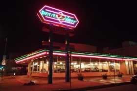
My final show of the tour was at a place called Bushwacker’s in Denver, and Jonathon was there. We were talking before I got on stage, and he told me that after the show he wanted to take me to the Denver Diner. At first I just thought it was a nice gesture to transition an internet friendship to a real-life one. A little later he reminded me of the online conversation, and I couldn’t help but grin.

I had a lot of fun at that final show, and after packing up my equipment for the last time on this tour, I followed Jonathon to the Denver Diner, a classic diner and apparently a bit of a local institution. The best part?

On their menu was an item labeled “Just a Cheeseburger”.

And it was delicious.

-MMcF

———————-

Unleaded rhythmic alt-pop fuels singer/songwriter and two-wheel troubadour Michael McFarland’s engine. Michael McFarland in the simplest summary? Writer, Rocker, Biker, Geek.

For Michael’s Music, Cd’s, Downloads, Merchandise, live show schedule, music blogs, music videos, and everything else you want to know about McFarland, visit the Michael McFarland Website at http://michaelmcfmusic.com/

Leave a comment